Case Study : OTTR
Ottr is a transplant care management software suite that has grown and evolved for well over a decade. As part of a modernization effort, I was brought in as Product Designer to update several aspects of the application, providing both a design refresh as well as fixing several sub-optimal workflows and adding new ones.
I was tasked with maintaining existing functionality while upgrading the user interface, standardizing layouts and form elements and building a common library of components for future expansion. I also had to adapt the design to be responsive so it was usable on tablets in a clinical setting.
Let’s dive in.

OTTR 7 - The Old App
Here’s where it all began.
OTTR had never had a dedicated Product Designer, so the UI was a result of several developer’s independent decisions over the years. While the interface was functional, it had many problems. Floating tabs, multiple button groups crammed at the bottom of the page and poor data hierarchy were just a few of the issues plaguing the software. All of this and more was on the leadership’s list of things to fix.
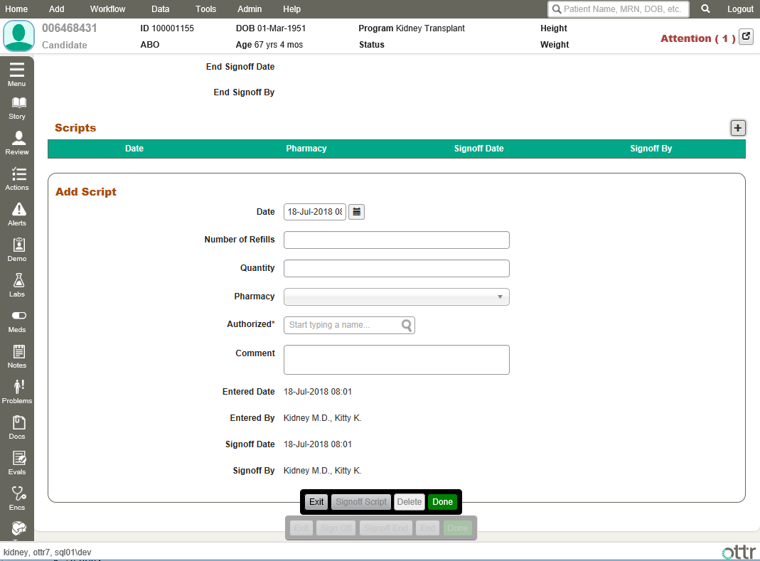
One of the primary design considerations was that Ottr is a very data-dense application with many forms and pages controlled by config files. Forms could sometimes be upwards of 200 questions long, and often had to follow a very specific field order to match up with regulatory-mandated reporting results. Layouts needed to be quite flexible while maintaining a common architecture and interface language.
Dashboard pages lacked clarity, and most screens were a wall of text that required considerable reading time to locate the information you needed.
My task was simple, if not considerable:
Redesign the UI for quicker navigation and data input / acquisition
Make the interface scalable for use on desktop as well as tablet screens
Fix the long list of issues that were causing confusion
Integrate several new features such as multi-tenant providers and improved analytics reporting
OTTR 8 - Starting Fresh
Before any designs materialized, I spent a significant amount of time talking with key stakeholders and our expert nursing staff to understand the primary problem areas in the current app and how the new features would fit into the existing architecture.
I moved onto wireframing, quickly iterating through workflows and refining the main interaction systems. I hosted several design workshops and user testing sessions and frequently uncovered aspects of features that weren’t part of the spec but needed to be solved.


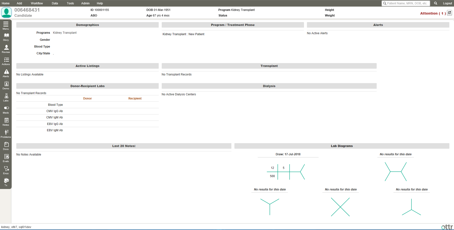
My primary goal visually was a clearer delineation of each distinct area in the interface and a cleaner presentation of data. I maintained a similar color scheme as before to keep in line with existing brand guidelines, but introduced some fresh colors and a more cohesive palette.
Each component was carefully designed to hold its data cleanly and clearly. For patient pages, the vertical menu on the left was moved to just below the header, making the layout far more mobile friendly and scalable. Each menu item could have a sub menu of options, which was given a blue background to help it stand out from the page during navigation.
Patient data in the header was cleaned up and zebra striped for faster visual parsing. My primary objective was speed of navigation and logical association of data so the clinical staff wouldn’t need to think as heavily about where data was supposed to go in the system.

The top-level navigation was reorganized and categorized so clinical staff could easily find the exact page they needed to reach even if they were new to the system. Each panel was sub-sectioned for better organization.
A very subtle fade animation was applied at a CSS level to menu navigation hover states and sub-menu show/hide. Being a medical app, we wanted to strike a balance between aesthetics and rapid visual feedback so the interface felt snappy and responsive (in case you were wondering, 0.15s is a wonderful animation interval for hover state changes).
All menu items and buttons were given as much clickable area as possible to optimize for touch input.
Gone are the awkward floating tabs, replaced with a scalable set of lite buttons that sit beautifully on the page. The form is neatly contained in the card instead of cramped up below the tabs.

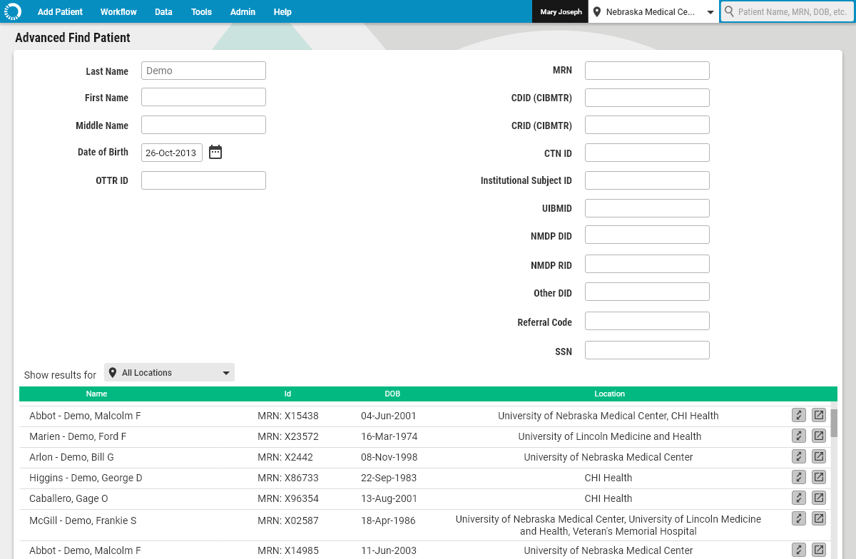
One of the new features added was a history function so staff could quickly return to a patient they had previously viewed.
I opted for a simple layout, showing name, DOB and image for rapid IDing of the patient, and under each a simple history of pages. An patient without an image would get a thumbnail with the first letter of their first name shown.
This feature is a great example of an industry-specific requirement: patients commonly have the same names, but name + DOB is typically unique enough for high-level IDing. MRN is the truly unique identifier, but lacks the rapid and intuitive validation of age + name, especially for in-person interactions.

Another feature that I architected was our Multi-Tenant system. Some hospital groups have multiple locations serving a common base of patients, so it was important to allow users to select which medical facility they were adding to or associating with patients and protocols.


This was also an opportunity to work with content design to gently guide users into the appropriate selections/options. For example, when selecting a physician, the menu divides them by both location and program, dynamically naming the sections to indicate the campus you’re picking from.

Tables were given an icon indicating if the particular action/medication/patient etc. was in the same place as the provider currently, or if it was outside the campus. This approach saved screen real estate instead of listing out the location’s full name in each row.
Dropdowns were added to both select a user’s current location (in the main header) as well have the option to view/place an item at a different location. Selection dropdowns were designed to be both a display of the location name as well as a way to switch.
Lastly, I designed a page for data auditing. One of the major challenges with an EHR system is identifying and sanitizing patient data. And when you have thousands of data points to manage, it can be overwhelming and expensive to have someone manually check.
The Organizational Health Report allowed medical professionals managing the system to quickly see every entry in the system that had something out of compliance. They could get high-level stats at a glance, satisfying macro reporting requirements. And any individual data category could be drilled into to expose exactly what needed attention and the ability to go to that form and fix it.

This was one of my favorite projects to work on in the course of my career. I had to work with complex workflows and regulatory limitations inside the framework of a very data-heavy existing application while adding several new features and modernizing the UI. In the end, I delivered an intuitive and scalable user experience that paved the way for future versions of the app. I fixed several areas of confusion for our users and left our engineering team with a thorough visual language to reference moving forward.